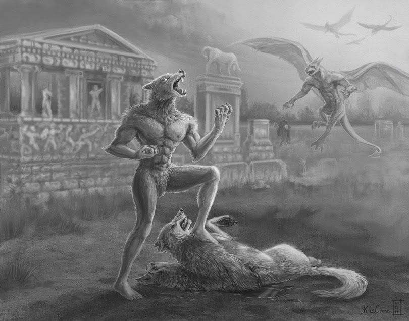
Primal Fury - Altered Beast Fan Art - Project KKG
 |
| Primal Fury - Altered Beast Fan Art - Project KKG - Completed on February 3rd, 2014 |
If you're an artist, and are interested in finding out more about the project or lending your pen to the cause, please visit http://www.gamersforgood.com/KKG-Artbook to find out more.
This piece was originally supposed to have one figure and no background and... it's certainly progressed from there! I feel like one of the iconic things about Altered Beast was that stylized graveyard you start out in so.... in it went. Without it, it just felt like a generic werewolf to me. Also it was really a fun challenge trying to remake the 16-bit Altered Beast "world" in Photoshop. Midway through I'd considered having it look more like a side-scroller, but I didn't like the idea of nullifying the potential for perspective. If I could do it again, I would have dug into a few more studies and thumbnails, that's for sure!
Here are some images of the creation process along the way:
Artistic Lessons on the Value of Re-scoping Projects Mid-Production
Over the years, I've gotten a lot better at planning in my life, and this craving to organize has carried over (thankfully) into how I approach my art.
With each piece, I try to spend a fair amount of time in the planning stages before I start work in earnest because I realize it really does pay off later, but I’m reminded on a somewhat regular basis that I still, STILL am not spending enough time in that stage, especially when the scope of a project increases exponentially.
Case-in-point: The “Primal Fury” piece above that was originally supposed to be one figure with no background, and I feel that I spent sufficient time during pre-production on thumbnails and poses and research and the like. This piece, however, has grown to include a total of 6+ figures, a complex background, perspective and more, and along the way I started going “it’s okay, I’ll figure this out as I go along…”
And I've done alright, I’m pretty okay with where the piece has ended up in black and white, and the moment I started in with color overlays… I realized just how very wrong I was. For while the values of the piece worked as a whole, the moment color was tossed in, all that careful planning went right out the window. I worked at the piece for over three hours trying to force it to work before resigning myself to the realization that making the piece work well in color would mean reworking large portions of the piece, and I simply didn't have the time to do that in terms of scope.
So my lesson here is that if I intend to likely bring a piece to color, I really need to make sure that in addition to doing value thumbnails, that I also do COLOR thumbnails too. Not one or the other: BOTH. Live and learn!
 |
| The WIP stopping point I reached on my initial attempt to try colorizing the piece to try to match the game’s original in-game colors. It... wasn't going well, particularly that bright gargoyle… :| |
(Above) Reference shots of the original Altered Beast game
The lesson here for me was to be aware that if the scope of your piece changes mid-production, you probably would be wise to do some new thumbnails!
On the whole though, I’m still very pleased with how the greyscale piece turned out, and going forward, I vowed to pay more heed to color thumbnails as well.
What lessons have you learned recently pertaining to the value of pre-planning, or what are some trouble-spots you’d like to improve upon?


No comments:
Post a Comment